.png)



You could have an amazing product. One that genuinely solves a real problem. One that your existing customers love. But if someone lands on your website and cannot figure out what it does in the first eight seconds, they click the back button and they never come back.
That is not a product problem. That is a website problem. And it is costing you customers every single day.
This is the story of why SaaS websites, meaning websites for software products that people pay a monthly subscription to use, end up killing their own sales and what you can actually do to fix it.
.jpg)
So What Even Is a SaaS Website Supposed to Do?
Think of your website as your best salesperson. Not your fanciest one. Your best one. The one who explains things clearly, never confuses the customer, and makes them feel like signing up is the obvious next step.
When someone lands on your homepage, they are basically asking three questions in their head:
- What does this thing actually do?
- Is this made for someone like me?
- Why should I pick this over what I am already using?
If your website answers all three in a clear, simple way, people sign up. If it does not, they leave.
The problem is most SaaS websites are built to look impressive rather than to answer those three questions. They look beautiful. They have smooth animations and shiny graphics. And they completely fail to do the one job they were built for.
Why Your Well-Designed Website Isn't Built to Convert
A 2024 benchmark report from High Alpha in partnership with OpenView and other SaaS research firms found that most software companies convert only about 15% to 25% of free-trial users into paying customers.
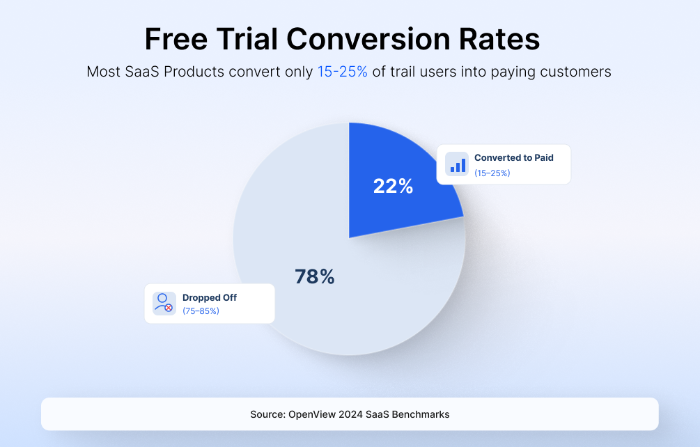
The ones that convert more are not always the ones with better products. They are the ones with clearer websites.
Your website is usually the first thing a potential customer sees before they ever try your product. If the website confuses them, they will not even get to the trial. And if they do not get to the trial, they definitely do not become paying customers.
Here is a simple comparison so you can see what we are talking about:
The pattern is simple. The more specific and clear you are, the more people sign up. The more vague and polished you try to be, the more people leave confused.
The Mistakes That Kill SaaS Conversions (And Why They Happen)
Now let us talk about the specific things that go wrong. Most of these mistakes happen because the people building the website know too much about their own product. They have been staring at it for months. To them, everything is obvious. But to a first-time visitor, nothing is obvious.
Mistake 1: The Headline That Could Mean Anything
Imagine you land on a website, and the first thing you read is "Work better together." What does that mean? What does the product actually do? Is it a calendar app? A messaging tool? A project management system? You have no idea. That kind of headline could describe literally thousands of products. It tells the visitor nothing.
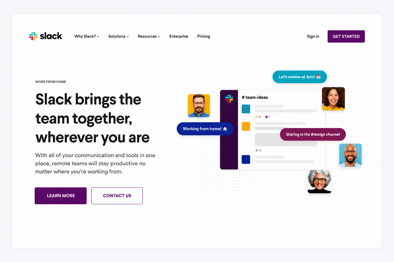
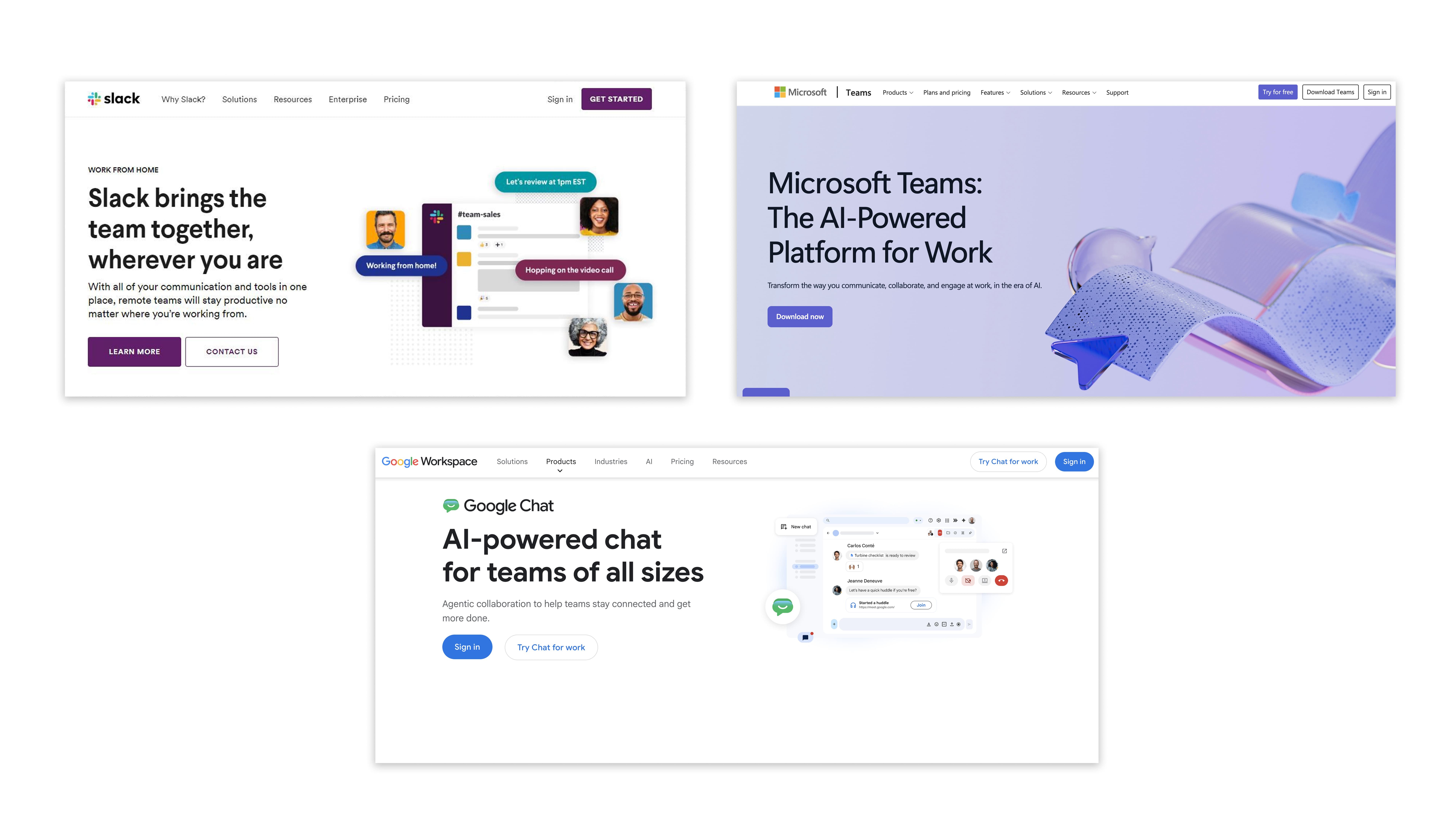
Slack, the team messaging app used by millions of people, used to have vague messaging like this early on. Once they changed their homepage to say "Slack brings the team together, wherever you are," more people started signing up. Why? Because now the visitor instantly understood what they were getting.
Its competitors do the same thing. Microsoft Teams says, "The AI-Powered Platform for Work." Google Chat says, "AI-powered chat for teams of all sizes." Both tell you exactly what you get the moment you land on the page. No guessing needed.
Mistake 2: Showing Too Much Too Soon
Imagine you walk into a restaurant, and before you even sit down, the waiter starts listing every single dish they have ever made, the history of the restaurant, the name of every chef, and details about the kitchen equipment. You would walk out.
That is exactly what most SaaS websites do. You land on the page and immediately see a list of ten features, three pricing options, five integration partners, and two different video demos. It is overwhelming and it makes people leave.
The first thing a visitor sees on your website, the part visible before they start scrolling, has one job. Make them want to keep reading. That is it. Not explain everything. Not list every feature. Just make them curious enough to scroll down.
Take Slack as an example. When they redesigned their homepage to lead with one clear message instead of a feature list, more qualified teams signed up and started using the product.
The change was not about adding more information or making the page look fancier. It was about saying exactly what the product does in the simplest way possible. The messaging did not get more complicated. It got more direct.
Mistake 3: Showing Logos Without Any Proof
You have probably seen this on many websites. A row of recognisable company logos with the text "Trusted by 5,000 companies" sitting above them. And honestly, that does matter. If 5,000 companies are using your product, that is a strong signal of credibility. It tells the visitor that real businesses have trusted you with their work, and that carries weight.
But for enterprise clients, logos alone are rarely enough. A large company evaluating your product does not just want to know who uses you. They want to know what you actually delivered. Did you save a team 10 hours a week? Did you help a company cut costs by 30%? Did you replace three tools with one? That is where case studies and proof of work come in. Showing the logos is a good start. Backing them up with real results is what turns a visitor into a serious buyer.
If you have even one real customer who got a real result, turn that into a story and put it on your homepage. It will do more for your signups than any logo wall ever will.
Mistake 4: Giving People Too Many Choices
Too many choices can quietly kill your conversions. Imagine you open a website and you see five buttons: "Start free trial". "Book a demo." "Watch a video." "Read the docs." "Talk to sales." Which one do you click? Most people click nothing. When there are too many options, the brain just freezes and picks the easiest one, which is closing the tab. This is a well-known thing in psychology.
Give people too many choices and they make no choice at all. Slack keeps it simple. Their main button says "Learn more", and the other one says "Contact Us" for teams that want a guided walkthrough before committing. Two options. One clear winner. That is all you need. Pick the one action you most want a visitor to take. Make that button big and obvious. Add one secondary option for people who are not quite ready. Remove everything else from that section of the page.
Mistake 5: Hiding the Product Behind Pretty Graphics
Here is the irony of expensive website design. The nicer the animations and the more polished the graphics, the longer it takes for a visitor to actually see the product.
Think about it from the buyer's side. You are about to sign up for a product you have never used. The most natural question is, "What will this actually look like when I'm using it?"
But instead of showing you the product, the website shows you a spinning logo, a gradient background, and a video of diverse people in a meeting room smiling at laptops. None of that tells you anything about what the product looks like.
Slack puts an actual screenshot of the product right at the top of their homepage. You can see exactly what the messaging interface looks like, how channels are organised, and how conversations flow before you even sign up.
Their headline says, 'Made for people. Built for productivity." Clean, simple, and honest.
Showing your product is not a weakness. It is the fastest way to turn a curious visitor into someone who wants to try it.
Here Is Something Most Founders Do Not Think About
Poor website design does not just stop new people from signing up. It also causes the wrong people to sign up.
When your website is vague, it attracts visitors with vague expectations. They sign up thinking the product does one thing. They log in and realise it does something slightly different. They cancel.
This is called churn, meaning people stop paying and leave. And a big part of it starts at the homepage.
ChartMogul’s 2024 SaaS research suggests that companies with stronger onboarding and higher early trial conversion tend to retain customers better in the first 90 days.
The connection makes sense. When someone signs up because they clearly understood what the product does and who it is for, they are much less likely to be disappointed after signing up.
So your website is not just a conversion problem. It is a customer quality problem. Fix the clarity of your website, and you will not only get more signups. You will get better, longer-lasting customers.
Design vs. Words: What Is the Real Problem?
Before you go spending money on a redesign, there is something important to figure out. Is your problem how the website looks, or is it what the website says?
These are two different problems with two very different fixes.
Most SaaS companies have a word problem that they try to fix by changing how the site looks. That almost never works.
If someone reads your homepage and still cannot tell a friend what your product does, that is a word problem. Fix the words before you touch the design.
What a Homepage That Actually Converts Looks Like
Here is the simple structure that works for most software products, especially ones that have found their first customers and are now trying to grow.
A strong SaaS homepage starts with a clear headline that explains what the product does in plain language, followed by a short sentence that tells visitors exactly who it's for. It should include a prominent call-to-action button, such as "Start Free" or "Try It Free, No Card Required," along with a real screenshot or product demo. Finally, build trust with customer ratings, authority badges, and a specific result achieved by a real customer, including their name and company.
As visitors scroll down, they should quickly understand the problem your product solves using the same language your customers use every day. Right after that, explain how your solution approaches the problem differently from other options on the market.
Next, highlight three to five key benefits of the product, focusing on outcomes instead of features. Rather than listing capabilities, show the practical results customers can expect, such as saving time, reducing manual work, or improving team visibility.
Further down the page, reinforce trust with real customer stories, measurable results, and clear comparisons against common alternatives. Include a simple pricing reference to reduce uncertainty, then end with another low-pressure call to action and an alternative option, such as a newsletter subscription or free resource, for visitors who are not ready to sign up yet.
Five Things You Can Do This Week to Fix It
You do not need to rebuild your entire website to start seeing results. Here are five focused things that will make a real difference.
1. Do the stranger test
Show your homepage to someone who has never heard of your product. Give them 30 seconds to read it. Then ask them to explain back what your product does, who it is for, and why someone would choose it over alternatives. If they cannot answer all three, your headline is not doing its job. This is the fastest way to find out whether your positioning is actually landing or just making sense inside your own head.
2. Listen to how your best customers describe you
Talk to five customers who genuinely love your product and ask them one question: how would you explain this to a colleague who has the same problem you had? Write down the exact words they use. These customers already understand your value and have figured out how to communicate it clearly. The language they reach for is almost always simpler, more specific, and more compelling than anything that came out of a marketing brainstorm. Put those words on your homepage.
3. Pick one customer type and rewrite your headline for them
If your headline is trying to speak to three different kinds of buyers at once, it is effectively speaking to none of them. Identify your strongest customer segment, the one where you win most consistently and where customers get the most value, and rewrite your headline specifically for that person. It will feel uncomfortable to leave others out. Do it anyway. Specificity is what makes positioning work.
4. Name what your product replaces
Look at your homepage and ask whether it is clear what a customer would stop using or stop doing manually if they switched to your product. If it is not clear, add one line that spells it out. Customers do not evaluate products in isolation. They are always comparing you to something, even if that something is a spreadsheet or their current manual process. Naming the alternative and showing why yours is better removes the biggest source of doubt from the buying decision.
5. Replace your generic proof with one specific customer result
A row of logos tells visitors that other companies use you. It does not tell them what changed for those companies. Find your single best customer outcome, write it as one clear sentence with a real name attached, and put it in the first section of your page. One specific result from a real customer who looks like your target buyer will do more work than ten recognisable logos.
Not sure where to start? Get your homepage breakdown, and we will show you exactly what to fix first.
Our Take on the Problem
Most B2B SaaS websites don’t fail because of bad design.
They fail because the messaging is unclear, the positioning feels generic, and the website doesn’t guide buyers toward action. As products improve and teams grow, the website story often falls behind, creating confusion across sales, marketing, and demand generation.
At Minute Creative, we help Series A SaaS and AI companies reset that story. We combine positioning, messaging, narrative strategy, website design, and Webflow development into one GTM-focused sprint. The result is a website that doesn’t just look modern; it clearly explains your value, speaks to the right buyers, and turns traffic into qualified demos.
.jpg)
.png)