.png)





Your marketing site, your product dashboard, and last quarter's landing page all look like they came from slightly different companies. The buttons don't match. The blue in your logo isn't the blue in your app. Sound familiar? That's usually the moment someone says "design system", and everyone nods like they know what that means.
Quick answer first: a design system is a shared set of rules and components, colours, fonts, buttons, spacing, and icons that everyone on your team uses to build anything visual, whether that's your product, your website, or your sales deck. Instead of every designer or developer making their own call, they pull from the same shared toolkit, so the company looks and feels consistent everywhere a customer encounters it.
Let's break down what that looks like in practice, and when it's worth building.
What's actually inside a design system?
If you've never built one, here's the plain-language version of what it includes.
Visual foundations. Your exact colours, fonts, spacing rules, and icon style are defined precisely enough that nobody has to guess which shade of blue is "the" blue.
Reusable components. Things like buttons, forms, cards, and navigation menus, built once and reused everywhere, instead of rebuilt slightly differently on every new page.
Usage guidelines. Rules for how and when to use each piece so a button that means "confirm" doesn't accidentally get used somewhere it means "cancel".
Brand voice guidance. Not just visuals, most mature design systems also define how the company sounds in writing, so a support email and a landing page headline feel like they came from the same brand, even if different people wrote them.
Put together, this becomes the single source of truth every designer, developer, and marketer pulls from, instead of everyone quietly making their own visual decisions and hoping it all matches up later.
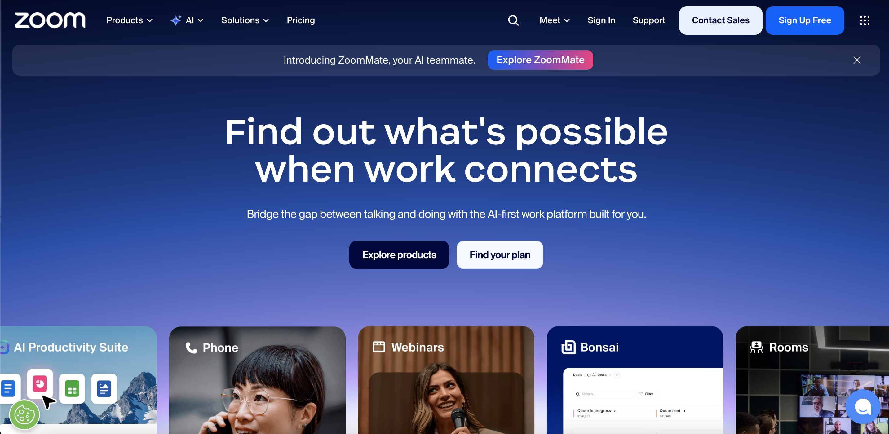
Zoom is a simple example of this working well. Its buttons, icons, and spacing look the same whether you're on the website, inside the app, or reading a help article. Nothing feels rebuilt from scratch each time, because it isn't.
Why does this actually matter for a growing SaaS company specifically?
It's tempting to think of a design system as a nice-to-have, something for later, once you're bigger. But for SaaS companies specifically, inconsistency has a cost that shows up faster than founders expect. Buyers are comparing your product against several others, often within the same browsing session, and a site or app that feels disjointed – slightly different fonts here, a mismatched button style there – quietly signals a lack of polish, even if the actual product underneath is excellent. Companies like Figma and Notion, both well-known for tightly consistent design across their marketing site and product, treat this consistency as part of the pitch itself: if the company can't keep its own visuals aligned, why would a buyer trust it to keep their data organised?
There's also a practical, internal cost to skipping this. Without a shared system, every new hire, every new landing page, and every new feature launch means someone is redeciding decisions that should've already been made. That's slow, and it compounds as the team grows.
When should a SaaS company actually build a design system versus just wing it?
Here's the honest signal list. If a few of these sound familiar, it's probably time.
- Your marketing site and your actual product don't feel like they belong to the same company.
- More than one designer or developer is touching visual decisions, and they're not aligned.
- New landing pages or features take longer to build because someone has to "figure out the style" each time.
- You've had a rebrand or repositioning recently, and the visuals haven't caught up everywhere yet.
- You're heading into a Series A or later stage, where enterprise buyers expect a polished, consistent brand across every touchpoint.
If you're a two-person founding team with one landing page and one product screen, don't overbuild this yet. A lightweight style guide is enough for now. Design systems earn their cost once there's more than one person making visual decisions and more than a handful of pages to keep consistent.
Notion is a good example of this stage. As the company grew past a small team, its visual system got tighter, and that consistency is part of why bigger companies trust it enough to buy in.
Design system vs brand identity vs visual identity: what's the actual difference?
These terms get used almost interchangeably, but they're not quite the same thing, and mixing them up leads to some confusion internally.
Brand identity is the strategy. Visual identity is the look that strategy produces. The design system is the operational toolkit that keeps that look consistent as more people build more things faster than any one person could review by hand.
A basic design system checklist for a growing SaaS company
If you're starting from scratch, here's roughly what the first version should cover.
- Color palette, with clear rules for primary, secondary, and accent uses
- Typography, including font choices and sizing for headlines, body text, and buttons
- A component library covering buttons, forms, navigation, and cards
- Spacing and layout rules, so pages don't feel randomly different from one another
- Icon and imagery style guidelines
- Voice and tone guidance for how the brand sounds in writing, not just how it looks
The real problem behind the "design systems for SaaS companies" search
Here's what usually happens when a team decides to fix this. Someone builds a beautiful component library in Figma, and six months later half the team still isn't using it consistently, because the design system was built as a visual exercise, disconnected from the actual positioning and messaging decisions underneath the brand.
A design system without a clear strategic identity behind it just becomes a prettier version of the same inconsistency, with components that look nice individually but still don't add up to a brand that feels intentional.
This is the gap Minute Creative works to close. Design systems get built alongside the strategic identity work, brand storytelling, positioning, and visual language together so the components aren't just reusable; they're actually saying the right thing about the company every time they're used. If your team has a component library sitting half-used in a design file somewhere, that disconnect is usually why. Book a call today to see how we can help close that gap.
.jpg)