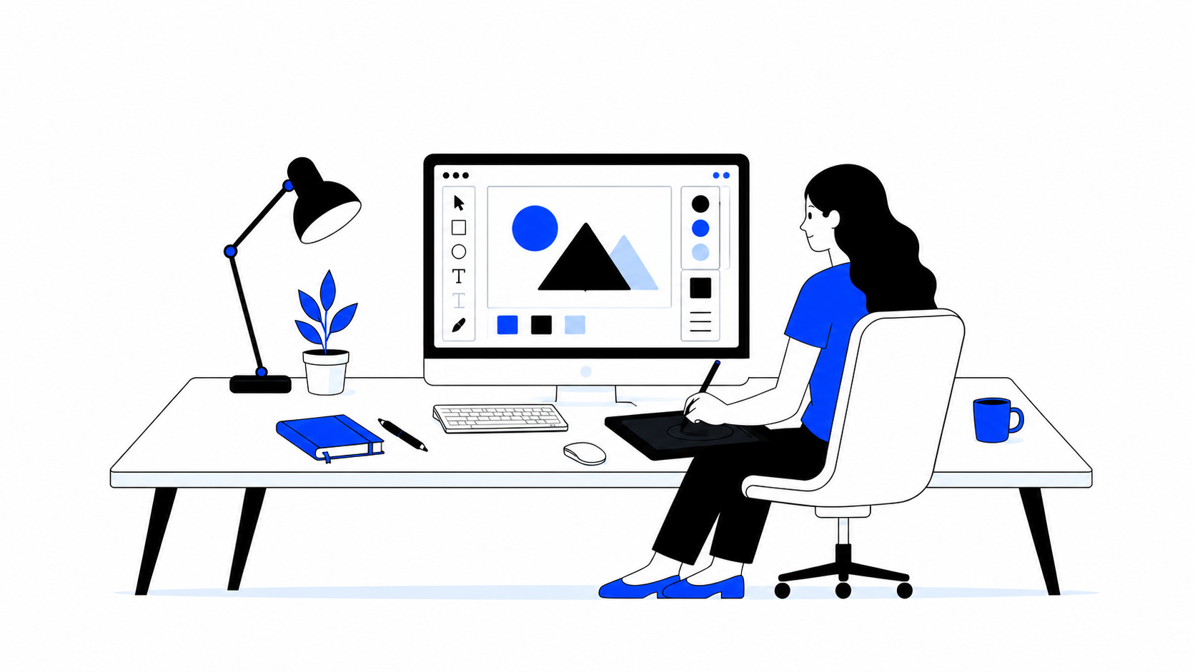
.png)



Most SaaS companies think they have a design problem. What they actually have is a structure problem. The website looks fine. Maybe even good. But the marketing team cannot update existing pages and create new pages without a developer. The CMS is a mess. Landing pages take weeks to go live. And when someone lands on the homepage, they leave without booking a demo.
This article explains what SaaS web design actually means, why it matters for B2B growth teams, and how to find the right partner to help.
So What Exactly Is a SaaS Web Design Company?
A SaaS web design company is a specialist agency that designs websites specifically for software businesses that sell to other businesses.
The difference from a regular web agency? They don't just make the website look good. They make it do its job: convincing the right visitor to take the next step, whether that's booking a demo, starting a free trial, or reaching out to sales.
.png)
A General Web Design Agency vs. A SaaS Web Design Company
A general web design agency focuses mostly on making websites look clean and beautiful. They start with things like colours, fonts, and layout design. Their goal is to make the brand look professional online. Success is usually based on whether the client likes the design. They rely on tools like WordPress or Squarespace, spend weeks getting the visuals right, and hand over a website that looks the part but rarely speaks to customers, resonates with the right buyers, or converts meaningfully.
A SaaS web design agency focuses more on getting customers and growing the business. They first understand the product, target audience, and customer problems before designing the website. Their goal is to increase demo bookings, free trials, and conversions. They usually use Webflow and show customer results, testimonials, and client logos to build trust and improve sales.
Why Most Website Redesigns Don't Actually Work
Here's the uncomfortable truth most agencies won't tell you upfront: Most companies that pay for a redesign don't see better results afterward.
.jpg)
The site looks nicer. The colours are more on-brand. The fonts are cleaner. But the conversion rate, the percentage of visitors who actually do something useful, like book a demo or start a trial, stays about the same. Sometimes, it even falls.
The reason is almost always the same: the agency started with design instead of messaging.
They opened Figma before they understood who the customer was. They asked "What should this look like?" before asking "What should this say and to whom?"
So the new site is fresher looking, but it still confuses visitors for the exact same reasons the old one did. The problem wasn't the colours. It was the story.
The agencies that actually move the needle start with a deep dive into the customer: what they're worried about, what they've already tried, what makes them trust a vendor, and why your product is the right answer. The design follows naturally from that clarity.
Why Does Your Website Keep Losing Customers?
Here's a situation that happens more often than you'd think.
A founder spends two years building a product. Real customers love it. The sales team closes deals on calls every week. The NPS score is great. Net Promoter Score (NPS) measures customer loyalty and satisfaction. But the website? It's confusing, outdated, and full of sentences that sound like they were written for a job application, not a human being.
Visitors land on the homepage. They scroll for five seconds. Nothing clicks. They leave.
This isn't hypothetical. It's the default state for most early-stage SaaS companies because the website was built when the product was half-formed and the messaging hadn't been figured out yet. The product evolved. The website didn't.
The result? Potential customers who could have become your best clients leave, frequently to a competitor whose product isn't even better but whose website quickly demonstrates the value.
Why does this happen? Because visitors can't quickly figure out the following:
- What the product actually does
- Who it's for
- Why they should care
That's not a design problem. It's a clarity problem. The message is blurry. A good SaaS web design company fixes the message before they ever touch the design.
.jpg)
What Does a B2B Growth Team Actually Need?
Growth teams are under pressure. They're running paid ads, testing landing pages, launching email campaigns, and constantly trying to figure out why some visitors convert and others disappear without a trace.
For all of that to work, they need a website that can move fast with them, one that can be updated quickly, tested easily, and improved without filing a support ticket to the development team and waiting a week.
Here are the five things growth teams say they need most:
Step 1: A Homepage That Makes Sense in the First Five Seconds
When someone lands on your homepage, they decide within five seconds whether to stay or leave. There's no time to be clever. The very top of your page needs to answer three questions instantly:
- What is this product?
- Who is it for?
- Why should I care?
A vague tagline like “Stop interviewing everyone. Start hiring the right ones" doesn’t really explain anything.
Something like “The AI recruiter that interviews hundreds of candidates so your team only meets the best ones.” does.
It tells visitors:
- what the product is
- who it’s for
- and why it matters immediately.
The best homepages aren't trying to impress everyone. They're trying to make the right person immediately feel like they've found the right place.
Step 2: Pages That Match How Buyers Actually Search
People searching for software don't type in product names. They type in their problems because they don't know your product exists yet.
A hiring manager at a growing company doesn’t search for “AI recruitment automation platform".
They search for things like the following:
- “Why is hiring taking so long?”
- “How do we screen candidates faster?”
- “How do we know which candidate is actually the best fit?”
- “How can we reduce recruiter workload without lowering quality?”
The best SaaS websites have pages built around real-world problems. Not a glossary of product features, but pages that speak directly to the frustration someone is Googling at 11pm when something has gone wrong again.
That is exactly what makes SEO and AEO work in B2B. Your website ranks on Google so buyers find you while researching. But increasingly, AI tools like ChatGPT and Perplexity are summarising and recommending products directly. Own both, and you get found before any salesperson enters the picture.
If your pages only describe what your product does, you will only find people who already know they need it. If your pages describe the problems it solves, you will find people in the exact moment they are ready to buy.

Step 3: Social Proof That Feels Real
Social proof just means showing that real people already trust you. This includes big company logos, short customer quotes, and ratings from platforms like G2 or Capterra.
But here's the thing most websites get wrong: generic praise is almost invisible. After reading hundreds of websites, people's eyes slide right past "Great product!" or "Really helpful team."
What actually stops someone is a specific result.
“We reduced candidate screening time by 70%," lands.
You can immediately imagine what that means for an overwhelmed hiring team trying to fill roles faster.
The more specific the outcome, the more believable the proof. If you can name the company, the role of the person, and the exact metric that changed, that's the kind of testimonial that actually influences a buying decision.
.jpg)
Step 4: A Clear Next Step That Matches the Price
This one sounds obvious, but it's one of the most common mistakes in SaaS.
If your product costs a few dollars a month, most visitors will sign up on their own. They don't need to talk to anyone. Your button should say the following: Start Free Trial.
Slack is a good example.
A team can start using Slack in minutes. The setup is simple, the product is easy to understand, and the risk is low. People can explore the product on their own and decide if it works for them without speaking to sales.
.jpg)
But platforms like Athmick are different.
Hiring affects entire teams and business outcomes. Companies want to understand how the autonomous recruiter screens candidates, runs interviews, and supports hiring decisions before they commit.
That’s why the right CTA is usually the following:
- Book a Demo
- See Athmick in Action
- Talk to Our Team
Using the wrong one creates friction at exactly the wrong moment. It's like asking someone to buy a car before they've even sat in it, the intention might be right, but the sequence is off, and the deal dies.
Step 5: A Website the Team Can Actually Edit
Growth teams need to move fast. Every minor change, be it headline text, a new pricing tier, or a campaign landing page, becomes a ticket, waiting on a developer, reviewing code changes. That team is going to fall behind competitors who can ship in hours.
That's why most modern SaaS companies use Webflow. It gives marketing teams the ability to make real changes directly, without touching code. New page? Done in an afternoon. Headline test? Change it yourself. Campaign landing page? Build it from a template without waiting on anyone.
How to Pick the Right SaaS Web Design Company
There are hundreds of agencies claiming to specialise in SaaS. Most of them are regular web agencies who added "SaaS" to their homepage after they landed one software client. Here's a simple way to separate the ones who actually get it.
If an agency can't answer these questions clearly and confidently, they're probably not the right fit for a growth-focused SaaS company.
What Does This Kind of Work Cost?
Pricing varies depending on scope, but here's a breakdown of typical ranges. These are US-market benchmark agencies; in other markets (like India, Eastern Europe, Latin America, and Southeast Asia), they often come in significantly lower for the same quality of work.
1. Messaging & Clarity Audit: $5,000–$12,000
A strategy-focused engagement designed to uncover what’s confusing visitors, where messaging breaks down, and how positioning can become clearer and more conversion-focused. Includes customer research, homepage messaging direction, and actionable recommendations before design begins.
2. Homepage & Core Page Redesign: $8,000–$20,000
Typically includes a homepage plus 2–4 supporting pages such as pricing, product, integrations, or use-case pages. Ideal for SaaS companies that need clearer positioning and stronger conversion flows without rebuilding the entire site.
3. Full SaaS Website Redesign: $25,000–$75,000+
An end-to-end redesign covering strategy, messaging, UX, visual design, Webflow development, CMS setup, and team handoff. Pricing varies based on the number of pages, product complexity, custom interactions, and CMS requirements.
4. Ongoing Growth & Website Support: $3,000–$10,000/month
A monthly partnership focused on continuous website improvement through landing pages, CRO experiments, messaging updates, SEO pages, and campaign launches. Built for fast-moving B2B growth teams that need ongoing iteration without relying on internal developers.
This is where We come in
A good SaaS website doesn't just describe your product. It makes the right person feel found. It builds trust before anyone picks up the phone. It gives your growth team the speed they need to test, learn, and improve without bottlenecks.
It's not decoration. It's infrastructure.
At Minute Creative, we approach SaaS web design as a growth system, helping B2B teams create web designs that communicate clearly, move quickly, and support the way modern buyers actually make decisions. We bring clarity, speed, and psychology to help SaaS and AI startups go from “we built something powerful” to “this is exactly who it’s for, and why they need it.
.jpg)
.png)