.jpg)


The best SaaS websites do one thing that most others do not, they make a stranger feel understood in the first 10 seconds. They do not just list features. They show the visitor that someone on that team knows exactly what keeps them up at night and that this product is the answer. That is what separates a website that converts from one that just looks pretty.
If you have ever landed on a software company's website and immediately thought, "Yes, this is for me," you have experienced a well-built SaaS website. And if you have ever left a site confused about what the product even does, you have experienced the opposite.
This article breaks down what the best B2B SaaS websites get right, with real examples you can study and apply.
What is a B2B SaaS website, and why does it matter more than you think?
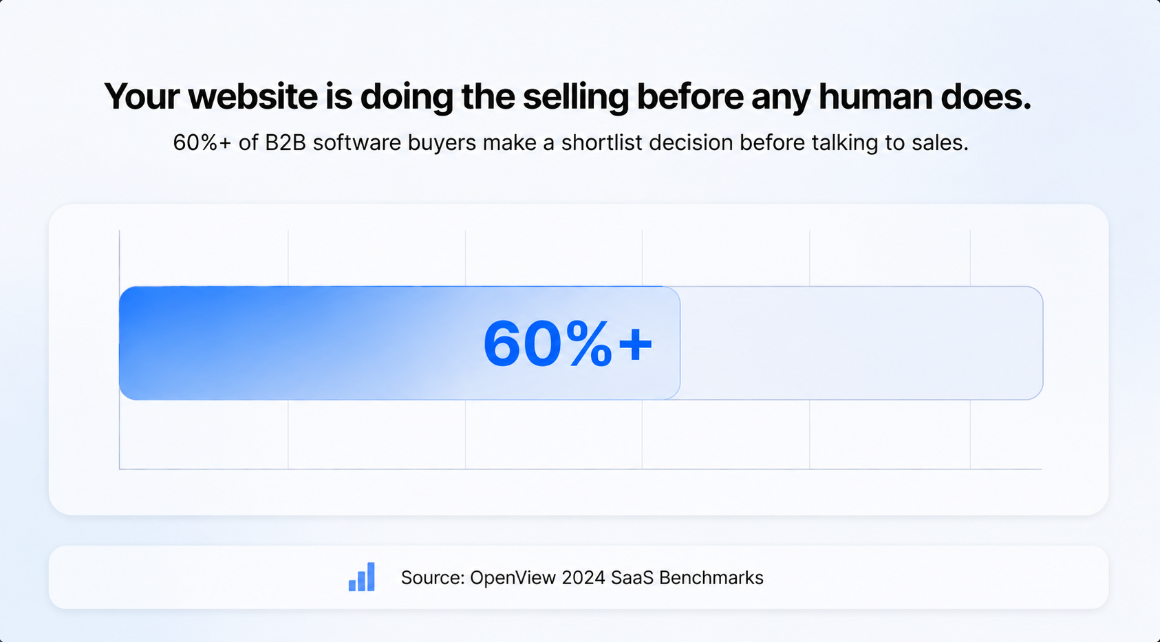
The reason these websites matter so much is that, unlike a physical store where someone can touch the product or talk to a salesperson, the website is often the first (and sometimes only) impression a potential buyer gets. According to High Alpha and OpenView's 2024 SaaS Benchmarks report, over 60% of B2B software buyers make a shortlist decision before ever talking to sales. Your website is doing the selling before any human does.
What do the best SaaS websites have in common?
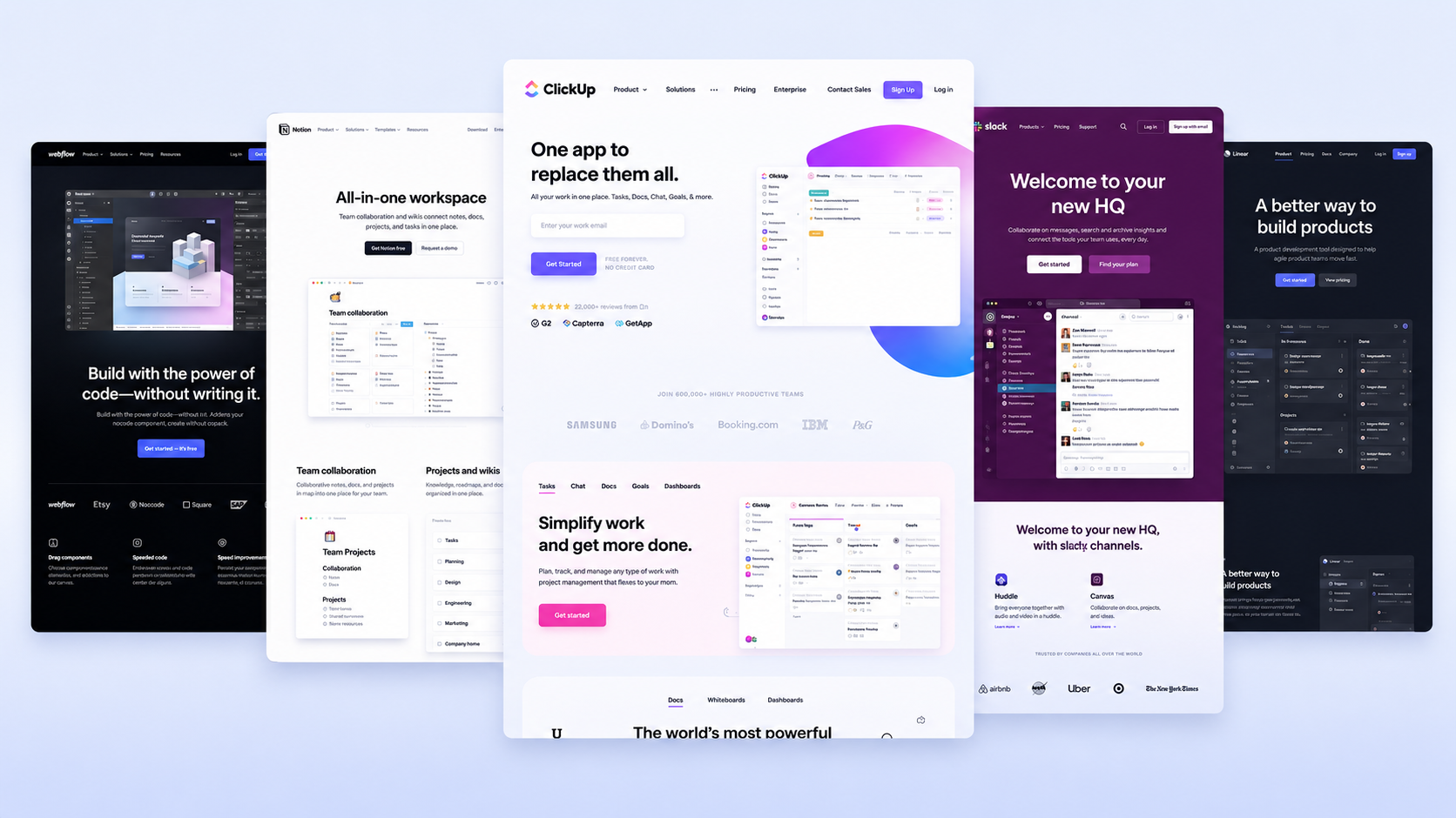
Look at the websites of companies like Linear, Notion, Webflow, Loom, and Figma. These are some of the most studied SaaS websites in the industry. And while they look different, they share the same core structure.
They answer four questions before anything else.
Before a visitor decides to sign up, book a demo, or read further, they are quietly asking: What is this? Who is it for? What does it replace? Why is it better? The best SaaS homepages answer all four questions fast. Not through clever slogans or vision statements, but through clear, specific language. This is what positioning experts call your "minimum viable positioning", and it is the foundational message your hero section needs to carry before anything else.
They show what you can do, not just how you will feel.
There is a common piece of advice that says SaaS websites should lead with the outcome. The problem is that vague outcomes like "make your team more efficient", "drive revenue", or "innovate faster" all sound identical. They put the burden on the visitor to figure out what the product actually does. The strongest SaaS homepages lead with capabilities: what the product lets you do, tied to a specific feature. That combination is far more convincing than a promised feeling.
They are built for one specific customer.
The best SaaS websites feel personal because they are not trying to talk to everyone. This is not just a tone decision. It is a strategic one. The first job of a homepage is to signal to the right customer that they are in the right place. When a visitor feels like the page was written specifically for them, they stay longer, read more, and trust the company more. That specificity comes from knowing who your product is for, what problem they have, and what they would use instead if you did not exist.
They make it obvious what to do next.
Every great SaaS website has a clear next step: sign up for free, start a trial, book a demo. There is no guessing. The call to action is visible, simple, and repeated throughout the page.
They load fast and work on mobile.
This sounds basic, but many SaaS websites fail here. Research from Edmonds Commerce (2025) shows that pages with around 2-second Largest Contentful Paint (LCP) can achieve up to 40–50% higher conversion rates compared to pages with 4–5 second LCP. Positioning and copy can be perfect, but slow load times will still cost you.
.jpg)
.jpg)
How does a great SaaS homepage actually work?
The homepage is the most important page on any SaaS website. Think of it like the cover of a book. If someone opens your homepage and still does not know what your product does after 10 seconds, they are gone.
Here is how the best SaaS homepages are built, section by section.
1. The hero section (the very top of the page)
This is the first thing anyone sees. It usually has a headline, a short subheadline, and a button. The best hero sections answer three questions without the visitor having to scroll: What is this? Who is it for? What should I do right now?
CAMB.AI positions itself as "the AI localisation infrastructure for 8B+ people", with a subheadline that leads with the core benefit: real-time dubbing that keeps your voice human across 150+ languages. The hero works because it is specific. It names the scale (8 billion people, 150+ languages) and the audience (creators and enterprises) and gives each one a clear next step: Start for Free or Book a Demo. No guesswork, no scrolling needed.
.jpg)
2. Social proof (the trust section)
After the hero, most great SaaS websites show you that other people already use and trust the product. This could be logos of well-known companies, a number ("used by 50,000 teams"), or short quotes from happy customers. This section exists because humans naturally trust things that other people already trust.
3. Feature explanation (the "how it works" section)
This is where most SaaS websites either win or lose. The mistake is listing every feature the product has, like a catalogue. The winning approach is showing a small number of features and translating each one into a clear benefit.
A feature is what the product does. A benefit is what that means for the customer. "Automated scheduling" is a feature. 'Save 3 hours a week on back-and-forth emails' is a benefit. The best SaaS sites always lead with the benefit.
.jpg)
4. Pricing (the honest section)
The best SaaS websites show pricing on the homepage or at most one click away. Hiding pricing frustrates buyers and signals that the company is not confident about its value. Notion shows clear pricing tiers with plain English explanations. No fine-print games
That said, pricing does not always belong on the homepage. If your product is custom-priced or enterprise-focused (like CAMB.AI), a fixed pricing table can confuse or push away the right buyers. In that case, a "Book a Demo" CTA works better. Simple rule: show pricing when the buyer can decide on their own. Skip it when the deal needs a conversation first.
.jpg)
The final call to action
At the bottom of every great SaaS homepage, there is one more invitation to act. By this point, the visitor has read everything. They just need one more nudge.
What makes SaaS website copy (the words) actually good?
Bad SaaS copy sounds like "Empower your enterprise with scalable localization workflows powered by next-generation language AI"
Nobody talks like that. Nobody thinks like that. And most importantly, nobody believes that.
Good SaaS copy sounds like "The AI infrastructure powering multilingual communication across the internet."
The difference is specificity and honesty. The best SaaS websites write like a smart friend explaining something, not like a corporate press release.
Three rules the best SaaS copywriters follow:
- Use the words your customers use. If your customers call it "client management", do not call it "relationship orchestration".
- Be specific. "Saves time" means nothing. Cuts onboarding from 3 hours to 20 minutes" means something.
- Cut anything that does not earn its space. Every word costs the reader attention. Make it worth it.
Feature vs. Benefit vs. Outcome: What is the difference?
This is one of the most useful things to understand about SaaS website messaging. These three words mean different things, and the best websites know when to use each one.
A feature is a specific function or capability your product offers, such as AI-powered translation and dubbing into multiple languages.
A benefit explains how that feature helps the user by making content accessible to people from different countries and languages.
An outcome is the final result the user achieves, such as reaching global audiences faster, increasing growth opportunities, and expanding without language barriers.
Most SaaS websites stop at features. Good ones reach the benefit. The best ones get to the outcome.
Which real SaaS websites get this right?
HubSpot's website is worth studying because of how it handles complexity. The product does dozens of things for dozens of types of businesses. Most companies in that position either try to explain everything (and confuse everyone) or say nothing useful (and convert nobody). HubSpot solves this by organising its homepage around what the customer is trying to grow, not what the product does. It leads with the outcome, then shows the tools underneath.
Figma is worth studying for a different reason. It started as a design tool but built its website around collaboration. "Design together" became a clearer story than "design software in the browser". That one pivot in messaging helped Figma become the default tool for product teams globally.
Positioning means how you describe your product relative to what your buyer already understands and cares about. It is not what your product does. It is the angle you choose to explain it from.
.jpg)
What is the difference between a good-looking SaaS website and a good-converting one?
A common trap is spending too much on design and too little on messaging. You can have a beautiful website that converts nobody.
Here is the honest comparison:
A good-looking website focuses mainly on visual style, animations, and design aesthetics. It often includes long feature lists, vague headlines, and very few calls to action because the main goal is to impress visitors visually. These websites are usually designed to win attention or awards.
A good-converting website focuses on turning visitors into customers. Instead of prioritising visuals alone, it emphasises clear messaging, fast load times, benefit-driven copy, and specific headlines that explain the outcome for the user. It also uses strong and repeated calls to action to guide visitors toward taking action. These websites are designed for buyers and business growth, not just appearance.
What are the most common mistakes on B2B SaaS websites?
Even well-funded SaaS companies get these wrong. Knowing them saves time and money.
Mistake 1: Writing for yourself instead of your buyer. When founders write website copy, they often use the language they use internally, which is not always how buyers talk. The fix is to read your copy out loud and ask, "Would a stranger understand this?"
Mistake 2: Too many calls to action. When every button is shouting at you, nothing stands out. Pick one primary action per section.
Mistake 3: No social proof above the fold. If a visitor does not see some signal of trust in the first screen, doubt creeps in. A logo bar or a short customer quote at the very top pays for itself.
Mistake 4: Explaining features, not outcomes. Covered above, but worth repeating. Nobody buys a drill because they want a drill. They want a hole in the wall.
Mistake 5: Ignoring mobile. According to StatCounter 2024–2026 data, mobile devices account for roughly half of global web traffic, often slightly above 50% depending on the month. A website that is hard to read on a phone is leaving deals on the table.
How Minute Creative Approaches This
Many B2B SaaS websites look polished but still fail to convert because the structure is weak. They speak too broadly, lack clear ICP messaging, and don’t guide buyers through a logical journey. Without strong positioning, content architecture, and conversion-focused UX, even great-looking websites underperform.
At Minute Creative, we fix the foundation before the visuals. Every project starts with a positioning and messaging strategy, so your website speaks to the right people and moves them toward a decision. Once the structure is aligned, we design websites that not only look modern but also drive qualified conversions and business growth.
.jpg)
.png)