.jpg)

Most SaaS founders spend months perfecting their product and about two weeks on their homepage. Then they wonder why visitors are not signing up. Here is the thing: for the majority of people who ever find your company, the homepage is the only page they will see.
They land, they look around for a few seconds, they make a decision, and they either move forward or they leave. That decision happens faster than most founders realise, usually within five seconds.
The best SaaS homepages in the world are not winning because of big budgets or fancy design agencies. They are winning because they are clear. This blog walks through exactly what those homepages do differently, with one real example for each lesson, and what you can take from them and apply to yours.
Your First Line Needs to Say Something Real
The opening line of your homepage is the most important sentence your business will ever write. It is the first thing every visitor reads, and it either earns the next thirty seconds of their attention or loses it forever.
Most SaaS homepages waste this opportunity.
They open with lines like "The future of collaboration" or "Work smarter, not harder". These lines feel polished, but they say nothing. A visitor still has no idea what the product does or whether it is relevant to them.
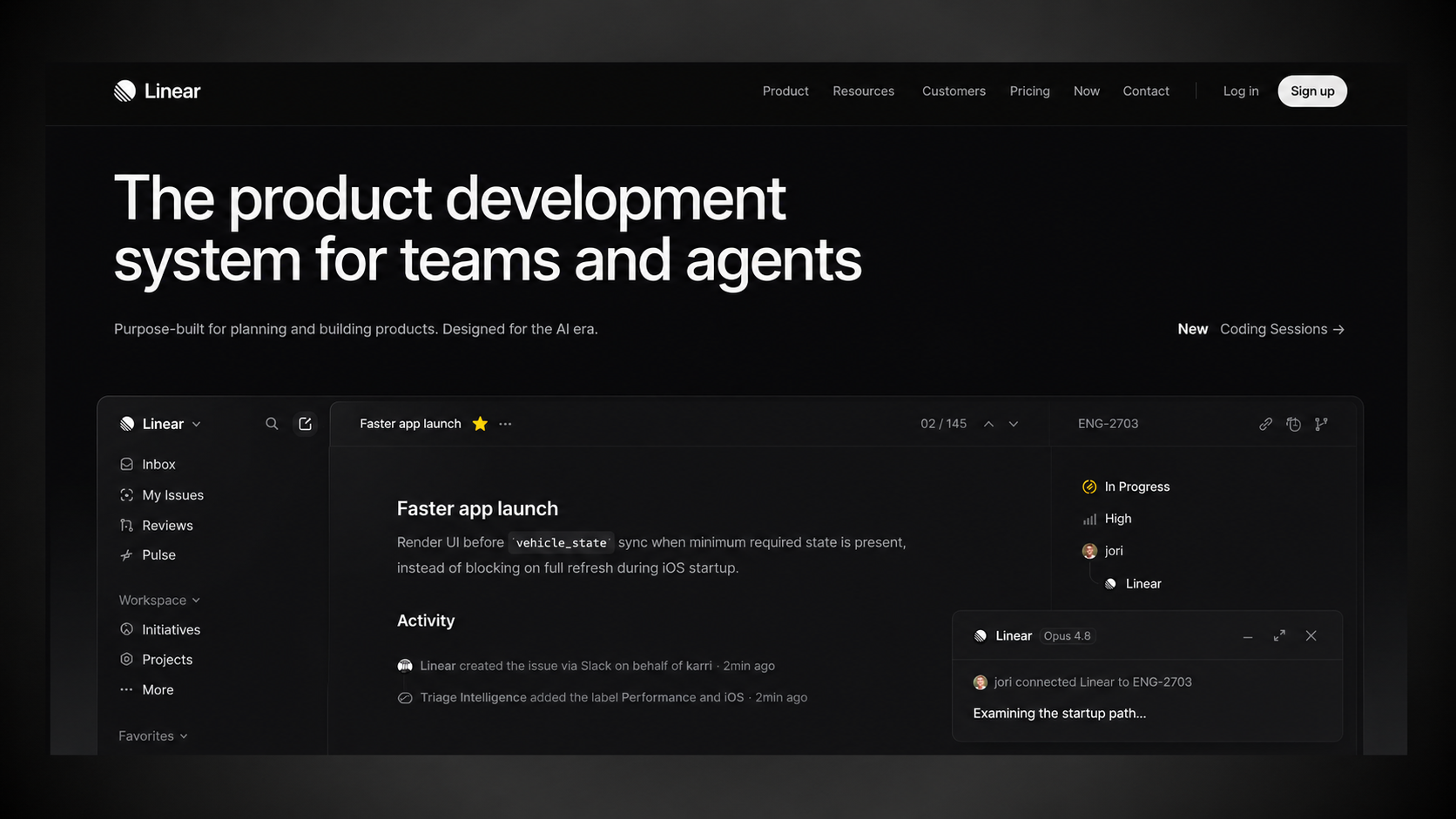
Linear gets this right better than almost anyone. Linear is a project management tool built specifically for software and engineering teams. Their homepage opens with one sharp, specific line that speaks directly to that audience. An engineer or product lead lands on the page and within three seconds thinks, "This was made for me." That feeling is what earns the scroll.
.jpg)
Write your opening line for one specific type of person. If it could apply to any business in any industry, it is too vague. Keep rewriting it until it could only apply to your customer.
Show the Product Before You Describe It
When someone visits your homepage, they are trying to answer one question: what does this actually look like? Describing your product in words is fine, but showing it is far more powerful. People want to see the thing before they commit to exploring it further.
Figma, the design tool used by product teams everywhere, does this exceptionally well. Instead of a screenshot or a marketing illustration, their homepage hero embeds a live, interactive canvas that visitors can actually touch and use before signing up for anything. By the time someone has spent thirty seconds on Figma's homepage, they already understand what using the product feels like. No description needed.
.jpg)
You do not need to build a live demo to apply this. But you do need a real product visual in your hero section, not a stock illustration, not a blurred screenshot, not an abstract animation. Show the specific moment where a user first understands the value of your product. That is what belongs at the top of your homepage.
Pick One Action and Make It Obvious
Once a visitor understands what your product does, they need to know what to do next. This is where most SaaS homepages make a critical mistake. They give visitors too many options at once: book a demo, start a trial, watch a video, or read a case study, all competing equally for attention. When everything is equally important, the visitor ends up clicking nothing.
Zoom, the video conferencing tool, keeps this surprisingly straightforward. Their two CTAs are "Explore Products" and "Find Your Plan", giving you either a way to learn more or jump straight to pricing. No pressure, no friction, just two clear paths depending on where you are in the buying journey.
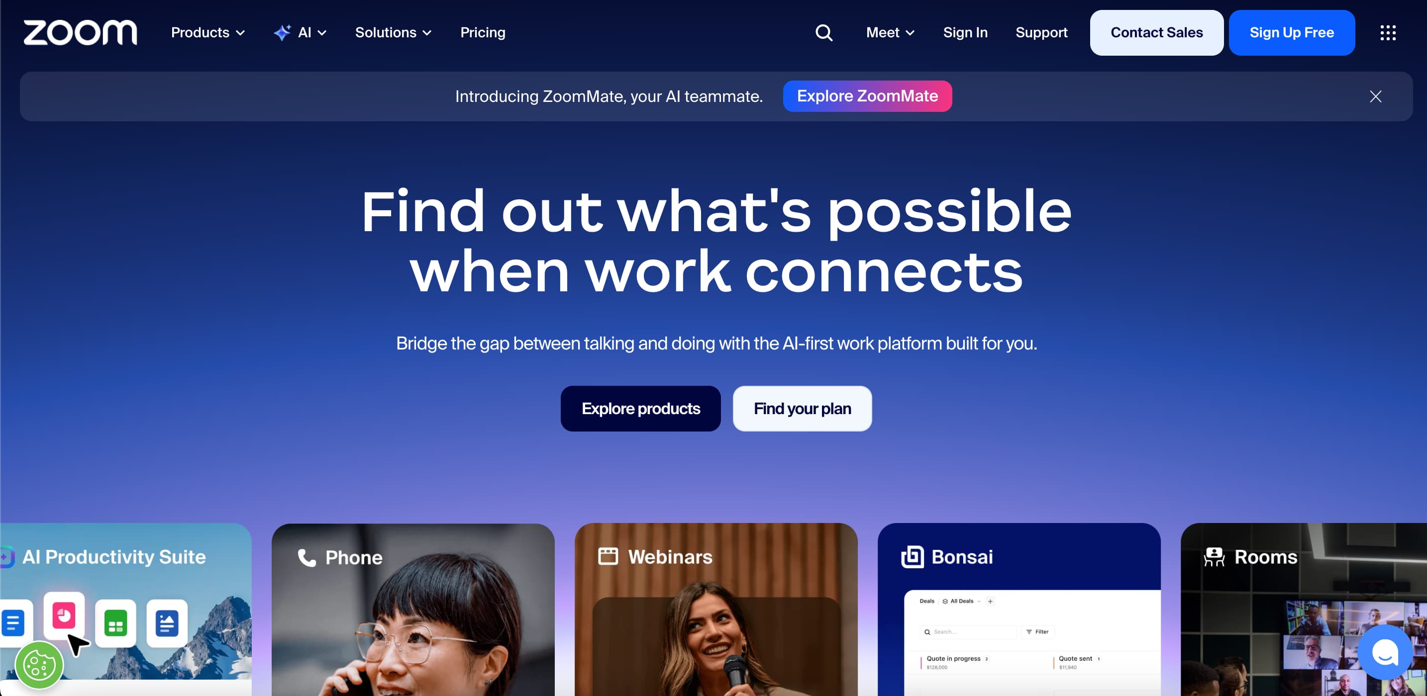
Pick one action you want most visitors to take and make it the most visible thing on your page. Then make the language of that button as specific as possible. The more clearly it tells the visitor what happens when they click, the more people will click it.
Put Your Best Proof at the Top, Not the Bottom
Social proof means evidence that other real people use and trust your product. It could be customer quotes, company logos, review scores, or outcome statistics.
Most SaaS homepages include some form of this, but almost all of them make the same mistake: they put it too far down the page, after the features section and after the pricing section, sometimes almost in the footer. By then, the visitor has already made up their mind.
Notion puts social proof almost immediately below their headline. They feature the logos of Figma, Pixar, and Spotify right near the top of the page. The logic is simple. If a visitor sees a company they respect using a product, it tells them something meaningful about whether it is worth their time, and it tells them before they have read a single feature description.
.jpg)
Take your strongest piece of social proof, one specific outcome from a real customer with their name and company attached, and move it as close to the top of your page as possible. Do not save it for people who are already convinced. Use it to convince the people who are still deciding.
Keep Your Navigation Simple
The navigation bar at the top of your homepage is not a directory of everything your company has ever built. It is a signpost that helps a first-time visitor find what they need without getting confused or distracted.
Framer, the website and design tool, keeps its navigation to just a handful of clearly labelled items. Their CTA button stays visible as you scroll so the next action is always one click away, no matter how far down the page a visitor has gone. Nothing in the navigation exists just because someone internally wanted more visibility. Every item earns its place.
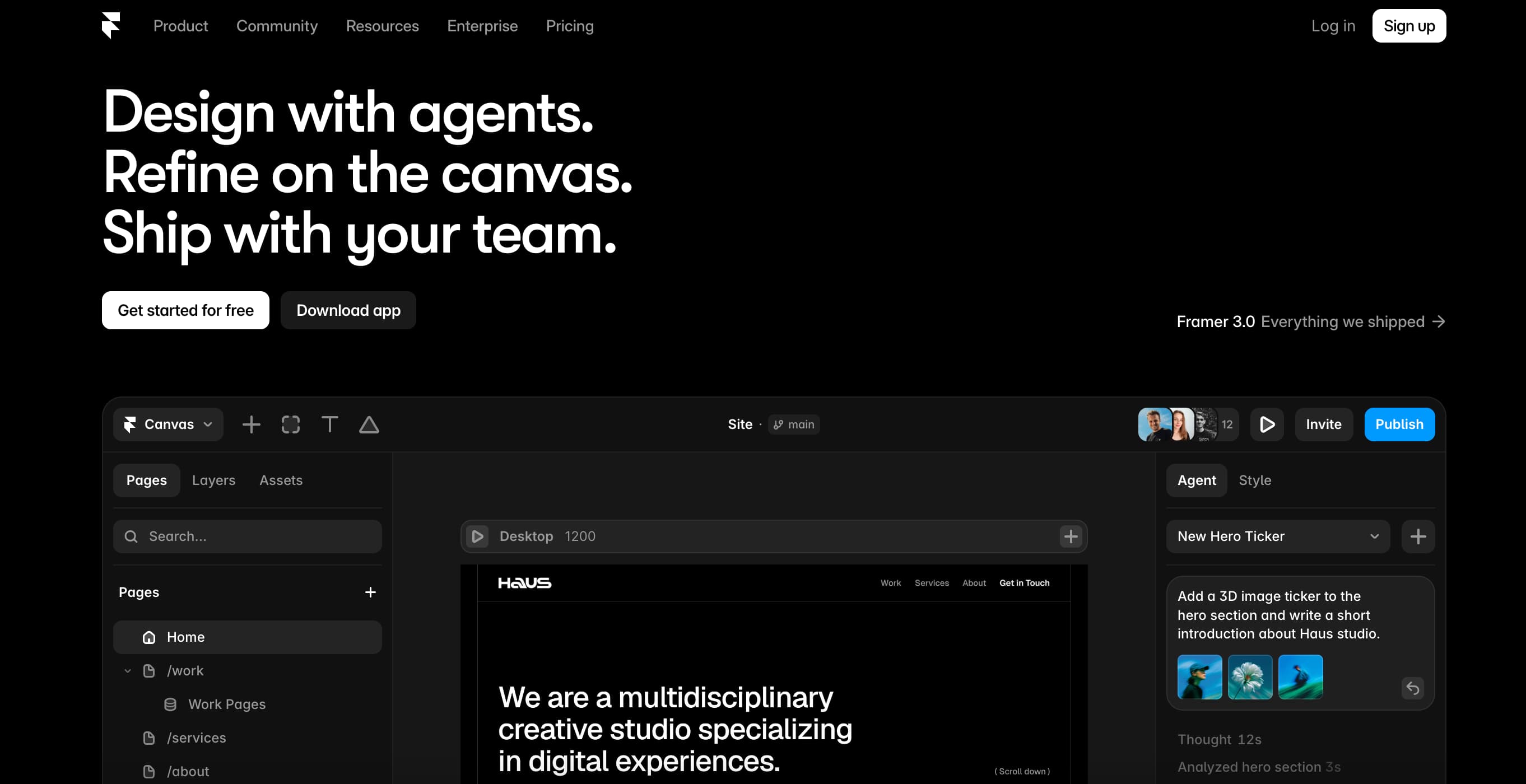
The most common navigation mistake on SaaS homepages is including too many items. When there are eight or ten links competing for attention, visitors do not know where to start, so they start nowhere. Keep your navigation to four to six items, ordered by what a first-time visitor most needs to see, with your primary CTA as a persistent button on the right.
A Slow Homepage Is a Broken Homepage
This one sounds technical, but it is actually a design decision. A homepage that takes five seconds to load is not a good homepage, no matter how well it looks. According to Think with Google, 53 per cent of mobile visitors leave a page that takes longer than three seconds to load. That means you could be losing more than half your mobile visitors before they read your headline.
[backlink}
Linear is a good example here beyond just its visual design. The homepage loads almost instantly despite having motion and animation throughout. That speed is intentional. Linear is a product that prides itself on being fast, and their homepage reflects that value from the first millisecond. The experience of visiting the page is part of the product's message.
Run your homepage through Google PageSpeed Insights, which is free, and work through the issues it surfaces. For most SaaS homepages, compressing large images alone makes a meaningful improvement.
Does Your Homepage Pass the Five-Second Test?
The best SaaS homepages, from Linear's sharp opening line to Figma's live product demo to Loom's single clear CTA to Notion's early social proof, all answer those three questions within the first five seconds. Not through clever tricks but through one thing: being genuinely clear about who they are for and what they want the visitor to do.
We work with B2B SaaS founders to find exactly what is breaking conversion on their homepage and fix it. Not a generic checklist. A focused audit on your actual page, with clear recommendations you can act on. If your homepage is live and you are not sure it is working, it probably is not working as well as it could.

.png)