


Here's a scenario that plays out more often than most SaaS founders want to admit.
You run paid ads. Traffic comes in. Google Analytics shows solid numbers. But the demo requests? Flat. The signups? Trickling. The pipeline? Not moving.
So you assume the traffic is bad. You tweak the targeting. You try a new audience. You increase the budget. The traffic goes up. The conversions stay flat.
The problem was never the traffic. It was the website.
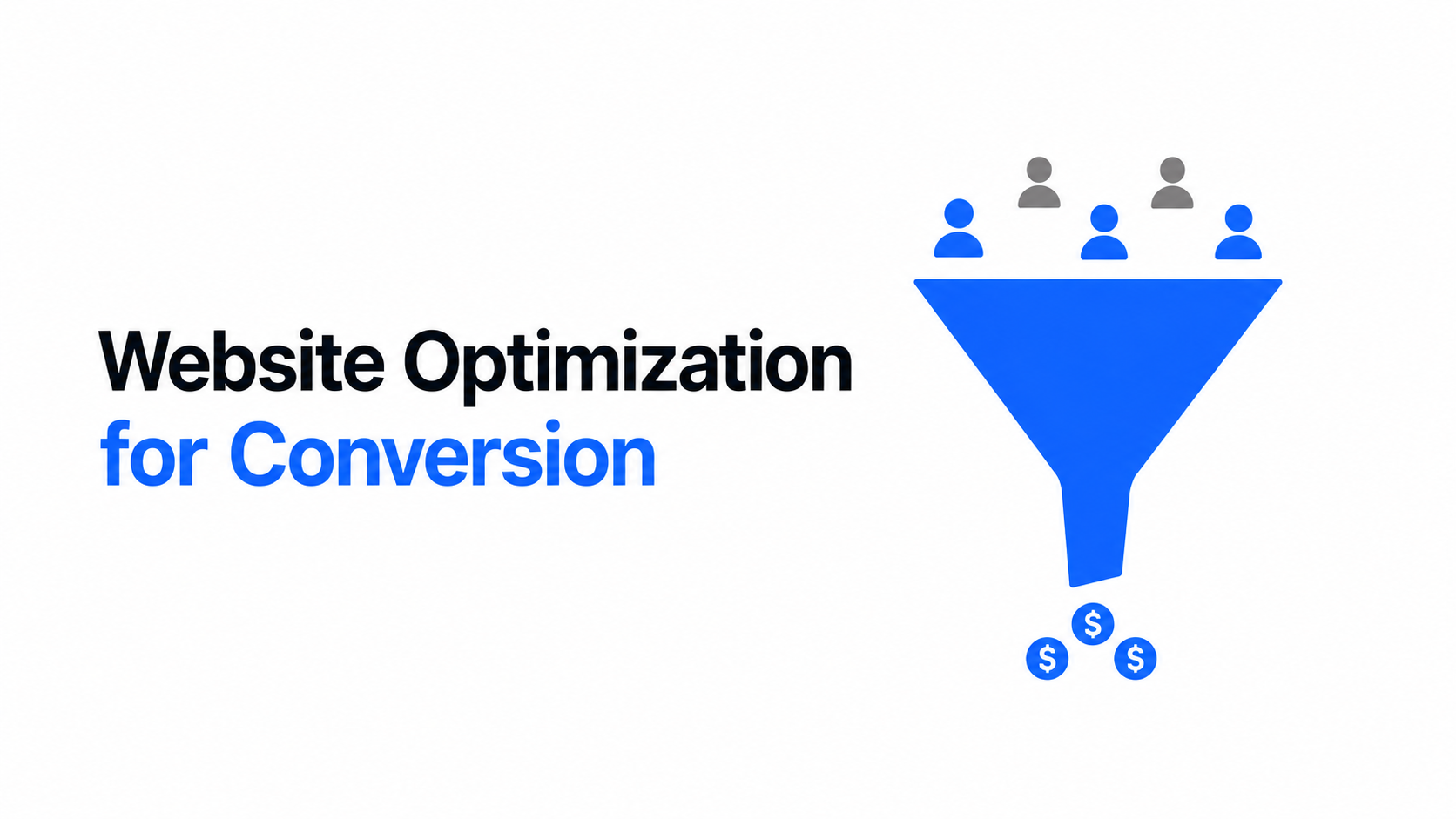
Website optimisation for conversion, often called CRO or conversion rate optimisation, is the process of making your website better at turning visitors into leads. Not by tricking people or adding more popups, but by removing the friction, confusion, and missed signals that cause real buyers to leave without acting. Most SaaS websites have more of these than they realise. Here are the seven that come up most often and what to do about each one.
Mistake 1: Your Homepage Talks About You, Not Your Buyer
Open your homepage right now. Read the first three sentences. How many of them start with "We"?
"We help businesses grow." "We are a platform for teams." "We believe in the power of collaboration." These sentences are about you. Your buyer doesn't care about you yet. They care about their problem.
The most common website optimisation mistake in B2B SaaS is hero copy that leads with the company instead of the customer. Notion's early homepage didn't open with "We built a new kind of productivity tool. " It opened with language that made the reader feel like the tool was built specifically for how they already think. Slack's homepage for years led with what the product eliminates, not what the product is. Email. Endless threads. Meetings that could have been messages.
The fix is straightforward. Rewrite your headline to name either the problem your buyer has or the specific outcome they want. Lead with them. Earn the right to talk about yourself three paragraphs in.
Mistake 2: One CTA for Everyone, Regardless of Where They Are
A visitor who just heard about your company for the first time is not ready to book a demo. Asking them to is like proposing on a first date. It's not that they don't like you; it's just too much, too fast.
Most SaaS websites have a single CTA repeated on every page: "Book a Demo", "Get Started", and "Talk to Sales". That CTA is only relevant for buyers at the very bottom of the funnel, the ones who have already done their research, compared their options, and decided they want to evaluate you seriously. According to data from the Demand Gen Report, that's roughly 3 to 5% of your website visitors at any given time.
The other 95% need a different next step. Something with lower friction. A free resource. A case study. A short video. A tool they can use without committing to a conversation.
The fix is to map your CTAs to where the visitor is in their journey. Top-of-funnel visitors get an educational offer. Middle-of-funnel visitors who are comparing options get a case study or a comparison page. Bottom-of-funnel visitors get the demo. Figma does this well. Their free plan is the CTA for early visitors, and the sales conversation is reserved for teams already evaluating the enterprise tier. Different stages, different asks, and far better conversion across the board.
Mistake 3: Trying to Serve Everyone and Converting No One
If you sell to startups and enterprises, your website probably tries to speak to both simultaneously. The copy hedges. The positioning is soft enough to not exclude anyone. The result is a site that feels like it was written by committee and resonates with nobody.
Website optimisation for conversion requires making choices about who you're talking to. The more specifically your website speaks to one type of buyer, the more that buyer feels like the product was made for them. And that feeling is what drives action.
Vercel built their entire website voice around developers. Every word, every example, every CTA is written for the person who reads documentation for fun and cares deeply about deployment speed. That specificity alienates non-developers, and that's fine, because non-developers aren't buying Vercel. Linear did the same thing. Their website is not for everyone who manages projects. It's for software teams who think Jira is too slow and Asana is too simple. They say so, essentially, on the homepage.
The fix is to pick your primary buyer and write directly to that person. If you have multiple segments, give each one a dedicated landing page or entry point. Trying to serve everyone on the same page serves no one.
Mistake 4: No Social Proof Where the Decision Actually Happens
Most SaaS websites put their testimonials on a dedicated page nobody visits. Or they drop a logo strip on the homepage and call it social proof. Neither of these does the conversion work that social proof is actually capable of.
Social proof works best when it appears at the exact moment the buyer has a doubt. When they're looking at your pricing and wondering if the ROI is real, that's when a customer quote about measurable results needs to be right there. When they're reading about a specific feature and wondering if it actually works, that's when a case study snippet needs to appear. When they're about to fill out the demo form and second-guessing whether the call is worth their time, that's when a testimonial from someone exactly like them needs to be visible.
Slack places social proof throughout their website, not just on a testimonials page. Each section of their product page has a customer quote or a real metric next to it. The result is that doubt never has time to settle. Every question a buyer might have is preemptively answered by someone who's already bought.
.jpg)
The fix is to audit every page for the moments where a buyer might hesitate and place the right proof there. Real names, real companies, real numbers. Generic quotes from happy customers don't convert. Specific results from recognisable buyers do.
Mistake 5: Slow Load Times You've Never Actually Measured
Here's an uncomfortable truth: most SaaS founders have never run a proper performance test on their own website. They know it loads fine on their MacBook on a fast office Wi-Fi connection. They've never checked how it loads on a mid-range Android phone on 4G in a city with variable signal.
Core Web Vitals is the framework Google uses to measure website performance. It tracks three things: how fast the main content loads (LCP), how quickly the page responds to the first user interaction (FID), and how much the layout shifts while loading (CLS). Sites that score well on Core Web Vitals rank higher in search and convert better because the experience is simply less frustrating.
The fix is to run your site through Google PageSpeed Insights today. Whatever score comes back, identify the top three issues and fix them. Common culprits are uncompressed images, too many third-party scripts, and fonts loading late. These are not complex problems. They're just ignored ones.
Mistake 6: Copy That Describes Features Instead of Selling Outcomes
There's a difference between what your product does and what your product means for the person using it. Most SaaS websites describe the first and barely touch the second.
"Real-time collaboration" is a feature. "Your whole team sees the same version, always, so nobody ever works off an old file again" is an outcome. "Advanced analytics dashboard" is a feature. "Know exactly which campaigns are driving revenue, not just clicks" is an outcome. The outcome is what the buyer is actually paying for. The feature is just how you deliver it.
This is one of the most impactful website optimisation changes a SaaS company can make because it requires no redesign, no new pages, and no developer time. It's a copy edit. Go through every feature description on your site and rewrite it as the outcome it produces. Buyers buy outcomes. They evaluate features to decide if they believe the outcome is real.
Mistake 7: You're Optimising the Wrong Pages
Most SaaS companies focus their conversion optimisation efforts on the homepage because it gets the most traffic. But homepage visitors are often the least ready to convert. They're early in their research, getting orientated, and figuring out if you're even in the right category for them.
The pages where buyers are closest to a decision are the pricing page, case study pages, and the demo request page. These are the pages a buyer visits when they're seriously evaluating you. And these are often the most neglected pages on the average SaaS website.
The fix is to look at your analytics and find the pages with high exit rates that sit late in the buyer journey. Make the case studies more specific. Make the pricing page clearer. Make the demo form shorter and the value of the call more obvious. These changes move the pipeline.
Your Website Is Losing Leads Right Now. Here's What to Do.
Every mistake on this list is fixable. None of them require a full redesign or a six-month development project. Most of them are copy decisions, positioning decisions, and structural decisions that can be made and implemented in weeks.
But they do require someone looking at your website from the outside, with fresh eyes, buyer empathy, and a clear understanding of what conversion actually requires. That's the work. And when it's done well, the results show up in your pipeline, not just your analytics.
If your website is getting traffic but not generating consistent inbound leads, the problem is somewhere on this list. Minute Creative audits and rebuilds B2B SaaS websites with conversion at the centre, from positioning and copy to Webflow development and SEO.
Book a free strategy call and we'll tell you exactly where your site is losing people and what it would take to fix it.